
In November 2016, the country underwent a monetary upheaval. When the Honourable Prime Minister announced demonetisation and introduced new currency notes we were shocked, curious, and generally unimpressed with the newcomers. A majority of the population couldn't digest the new designs. We simply haven't warmed to the colours. What could the underlying reason be?
As a multicultural nation exposed to all sorts of arts and design schools, from rock paintings to graffiti art, from minimalist home decor to filigree metalwork, we've pretty much seen it all. And living in an age where we are flooded with information, we have internalised certain principles of design. We know the importance of consistency. We appreciate thematic ideas and have an innate curiosity that makes us wonder why something was designed the way it was.

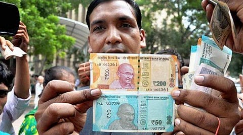
The contrast of colours used along with the strange combination of patterns only added to the distaste towards the alien looking notes. Our currency notes have always been decorated with opulent curlicues and a number of elements crowded together vying for attention. But this time there was an unbelievable number of fonts and
typefaces.
The rather unflattering illustration of the Mangalyaan in tones of magenta didn't help either. It closely resembles a science textbook illustration- those diagrams aren't meant to peak anyone's interest! On the other side of the note is the evergreen smiling face of Mahatma Gandhi; a tad smaller this time but similar enough to render familiarity.
The Internet would be a great source if one goes looking for the myriad micro printing Easter eggs that the RBI claims to have put on each note. Many claims that reducing the size of all the new currency notes have made them drastically different to the sight and feel. People have also frequently started to mix up their notes- handing over the 500 in place of a 100, an odd coloured 200 in place of a 10 and so on.
There is no homogenous thematic thread that holds the various elements together, so to speak. And as far as the common man is concerned, the choices of colour were quite unusual- of late, the note refers to a 2000 rupee note and the blue-green one means 50 rupees. Woe to those who ask for a brown note; we have way too many shades of them. Design professionals from around the country have criticised the ideation and conception of the latest paper currencies and have raised a number of pertinent points.
Why make the notes so different and unfamiliar? The not- so- soothing aesthetics have only earned a snort of disgust or a long-suffering sigh. The RBI could have asked for suggestions from the general public or at least private agencies before committing such major faux pas in design. The Government has hinted at a complete phasing out of the current design scheme and introducing more new ones. Let's keep our fingers crossed.
(Anne Mary Thomas is a former professional of Communication Studies and is an Arts and Communications scholar. A freelance illustrator and writer, she hopes to explore the underlying ideas behind art and artists)